
The effect of color on sleep quality
The influence of color on our mood is widely known, but did you know that the colors in your bedroom can also play a significant role in your sleep quality? Colors have a psychological impact that affects both our mood and physical responses. In this blog, we explore how colors can either improve or disrupt your sleep and which shades work best for a good night's rest.
1. Blues: The calming choice
Blue is known for its calming and relaxing properties. It is one of the best colors to use in your bedroom because it helps lower the heart rate and calm the nervous system. Studies have shown that people who sleep in a blue room fall asleep faster and experience deeper sleep. Choose soft, cool blues such as light blue, for a serene atmosphere.
2. Greens: Nature and balance
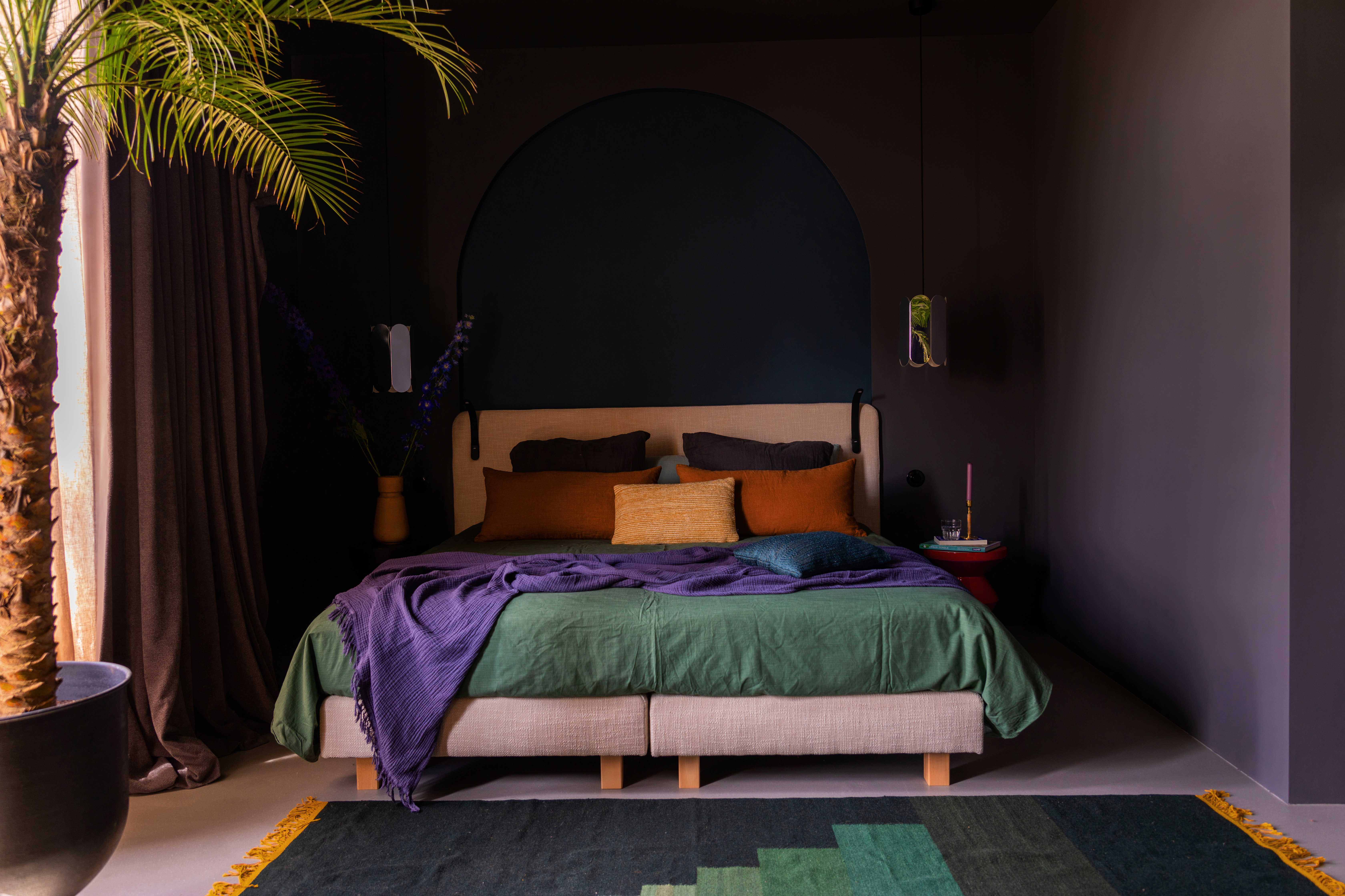
Green is often associated with nature and is a color that promotes calm and balance. It helps the body relax, making it ideal for creating a peaceful sleep environment. Darker greens, like forest green, can be particularly effective, while lighter green shades, such as mint, can have a refreshing effect. Green’s natural association with calmness and stability makes it an excellent choice for a bedroom.
3. Whites: Bright and fresh, but do not overdo it
White is a color often chosen to make a room feel larger and brighter. It also has a calming effect, especially when combined with natural materials. However, too much white can create a feeling of emptiness or coldness, which might hinder relaxation. Use white as a base color combined with softer tones like beige or light grey to add warmth and comfort.
4. Greys: Subtle and elegant
Grey is a neutral color commonly used in modern bedrooms. It has a calming effect and can promote a sense of quiet and rest, making it ideal for a good night’s sleep. Choose soft grey tones instead of darker shades, which can make the room feel gloomy. Grey pairs well with other calming colors like light blue, white, or beige.
5. Yellows and oranges: Stimulating, but in moderation
Yellow and orange are warm colors that radiate energy and joy. While these shades work well to boost mood during the day, they can be too stimulating for a restful night’s sleep. They can activate the brain and make it harder to relax. If you want to incorporate these colors, choose soft, muted shades like pastel yellow or apricot.
6. Reds: avoid in the bedroom
Red is a color known for its power and energy, but it is not the best choice for a bedroom. Red can raise blood pressure and stimulate the nervous system, making it difficult to unwind and fall asleep. While it may seem appealing as an accent color, do not use red as the main color in your bedroom. Opt for more soothing shades that promote relaxation.
7. Purples: Luxurious but use sparingly
Purple shades are often associated with luxury and spirituality and can have a calming effect if used correctly. Dark purple tones, like aubergine or lavender, can create a sense of mystery and calm. However, it is important not to overuse purple as it can be too intense and disrupt your sleep. Use purple as an accent color to add a touch of sophistication.
The colors in your bedroom can significantly affect your sleep quality. By choosing calming shades like blue, green, or grey, you create a peaceful, relaxing environment that is conducive to a good night’s sleep. Avoid overly bright colors like red or bright yellow, which can disrupt your sleep, and use warm, soft tones to strike a balance that helps you unwind.
When decorating your bedroom, it is important to choose a color palette that not only looks good but also promotes your well-being. Experiment with different shades to find what works best for you and enjoy a deeper, more restorative sleep.